
COMMISSIONS
During my time at uni and after I have produced a diverse body of freelance work for various clients.


A recent commission
Freelance work has given me the opportunity to really perfect creative practices, constantly improving and finding innovative ways to make my work unique. It's enabled me to stay up to date with creative trends and communities.


EVENT COMMISSIONS
I was asked to create an event poster for the nightclub G-A-Y in Manchester. This commission was to advertise an event for the singer Charli XCX's recent album and tour 'Brat'. The final poster was first shown on their social media, it received positive engagement and publicity for the event and for the club itself. This could be credited to both, timing and unique design.
Charli xcx's tour had fantastic marketing and promotion behind it, making it easy to take key elements and create something recognisable with a graphic edge. There were competing venues along canal street hosting their own events on the same night, so G-A-Y wanted the poster to have a unique look.
I made the poster using pro create, layering text, images and information relating to the event. The image I chose was taken from her boiler room set to market her new album I chose it as it reflected certain qualities that demonstrated 'the attitude and energy from the album. 'Brat' is described as 'Confidently rebellious, unapologetically bold, and playfully defiant', the final outcome had to exhibit elements of that. I kept the album title in its original font as there were strategic design decisions behind it and the intentional garishness that symbolised the entire album.

The client wanted two size variations of the poster, one for social media and one for the screens at the venue. This meant creating a larger image to begin with and adding in layers that could be moved and scaled down to fit the aspect ratio of instagram.


EVENT POSTER
After the success of the 'brat' event, I was asked to do another themed poster, this time based on Lady Gaga's 'Mayhem' tour. The venue was going to host a similar after party event after her Manchester concert.
After researching what 'mayhem' was about I began to create some initial sketches. It could be said that Lady gaga has a varied style, the music videos and visual stills from this project reflected this. Therefore, I wanted to make sure the poster would demonstrate that.


I decided to move away from a hand drawn style for the poster as it wouldn't have worked well on G-A-Y's social media. Most of their other events feature photographs and bright colours, I instead pivoted towards images and bold backgrounds.

The client had asked for a 'teaser' poster before the release of the main poster in hopes to generate more social media engagement. The aims of the poster were to display basic information about the date of the event, the name of the venue and a relevant image without giving too much away.
i chose a black and white image of Lady Gaga from the 'Mayhem ball tour' photoshoot. The photograph was perfect for the composition of the main poster.
For the teaser poster, i cropped the image right down to make it slightly ambiguous and placed it onto an orange textured background using pro create and added the album name, date and logo. I had a few different compositions for this design and sent them over to the client.
Although he liked the style, he made a great point that the teaser poster looked a lot like an album cover. With this in mind, i changed the design completely.

After watching the music videos for the songs on the album, I added three different images to the teaser trailer in a film poster style. However, the client had decided on the previous poster after speaking with management, despite initial uncertainty about the layout.
The client pr

Once the teaser had been released, I began to create the main poster. I placed faded stills from music videos behind the main black and white image and a cracked mirror effect (this idea was taken from the mayhem album cover). I blended the images with the orange layer below to create a textured look. There was still a lot of white space around the poster so I filled a few gaps with small stars.


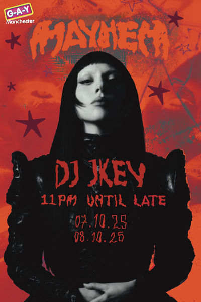

I added a further layer and some glitch effects. The Mayhem album is described as 'A Masterpiece of Chaos and Creativity' so I wanted to make sure it reflected that and G-A-Y's socia media theme. I sent these images over to the client and he decided to go with the image with white writing.
(source-https://allboutmusic.net/lady-gaga-mayhem/)

The final poster featured on the night and on social media.
'DYKES WHO HIKE'
'Dykes who hike' are a walking group for queer women, trans an non binary people based in Leeds. They were looking to change their branding on their social media. The aim was to change the style to something more 'whimsical'. They showed me other social media pages that they liked and some of my work they thought fit the stye.


I began by blocking out rough shapes with a thumbnail to see how the information would look together. I only had tree days to complete this project so I didn't want to waste too much time on thumbnailing. I worked on the images in pro create, tracing my hand drawn font.

I added some stars to fill some of the white space and to stay on brand with the whimsical theme. It was lacking the illustrative elements of my previous work the client had said they liked so i began to experiment with some illustrations.

I had some illustrations featuring some queer coded characters I had drawn previously and placed them behind the text with a soft light blend effect. The client thought a simple illustration would work better, I agreed, the characters were too noisy behind the text and the post needed to be straight forward.

I decided to add in a really simple image of a carabiner. It is a recognisable fashion accessory/signal amongst lesbians and the queer community with a long history. With the activity also centering around hiking and the outdoors, it seemed like the obvious choice to add it. I added one to the top and bottom for symmetry, it also frames the text nicely.m

The client requested a beige background for the post. I then added some texture to make it look like it was on paper.

SUPPER CLUB:
I was asked to create a graphic for Loaf Far Headingley in Leeds for an evening dinner service. The cafe's branding on their menu featured the font 'Calibri', they used the colour red to highlight specific parts of the menu. I incorporated this into the text through little star illustrations and important parts of the text.

(Loaf Far Headingley menu layout)


Illustrations featuring ingredients used on Loafs menu, displaying a mint leaf, a cucumber and a hummus bowl. These detailed illustrations worked well with the looser typography style to tie the image together.


The looser illustration style used for the text and star illustrations gives the poster a less formal look which better fits the theme of the supper club event.

I placed the illustrations around the border of the poster incorporating the logo in a central point at the top. I used a paper texture for the background from the website 'Unsplash' to give the poster more dimension.

Combining all the elements gave me the final outcome featured above. The client was pleased with the final outcome.
HEAD OVER MEALS
'Head over meals' was a project i undertook in my final year of university in 2022. I was just beginning to learn about personal branding and visual identity. The client wanted a logo for their food themed Instagram page. It was going to feature recipes photos and videos of food and cooking.

I found this picture on the website UnSplash and created the text in photoshop. I warped the text to look like the word 'head' was leaning over the rest of the name so it was on theme with the pun. I placed it in the centre of the image; most of the picture wouldn't be visible as it gets cropped to fit the circular dimensions of the Instagram profile picture guidelines.

I used Adobe Premiere Pro and After Effects to create this video.

I took some high resolution pictures for them to add to their instagram for thumbnials and general aesthetic.

![Untitled_Artwork[1757]_edited.jpg](https://static.wixstatic.com/media/6a68d3_195edc7314dc4d6c998e4015b3618dc8~mv2.jpg/v1/fill/w_472,h_668,al_c,q_80,usm_0.66_1.00_0.01,enc_avif,quality_auto/Untitled_Artwork%5B1757%5D_edited.jpg)
This was an illustration i created in the planning stages of creating their brand. The client decided it was a little too lively for what they had in mind but liked the illustration.